THE WORLD'S LARGEST NEWSSTAND... REENVISIONED.
ZINIO has been the industry leader in digital magazines since 2001. They pioneered the technology and publisher relations to create the largest collection of digital magazines in the world. And, with the introduction of the iPad and other tablets in 2010, ZINIO’s growth has exploded.
Over the past five years of their meteoric rise in digital publishing and distribution, ZINIO had undergone a variety of changes around their technology, leadership, and product vision. Rein visioning the brand, user experience, and use of technology was part of their strategy to usher in new changes to the market.
A complete audit of ZINIO’s impact to its readers and publishers was conducted. A refined mission, vision, personality, and values were established to create clear goals and focus for the business, marketing, and product design. The result is a personality and visual overhaul that maintains ZINIO as the industry leader in magazine and article distribution.

The Vision
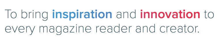
As a technology company within the publishing and media industry, ZINIO has always been nestled between the reader and the publisher. Or in other words, the consumer and the content creator. It’s always been important to position the products as useful and engaging while keeping a somewhat transparent brand.
The new brand approach encapsulated these ideals into a simple vision: To bring inspiration and innovation to every magazine reader and creator. This vision was then extended into a more tactical mission statement and nuanced visual executions.

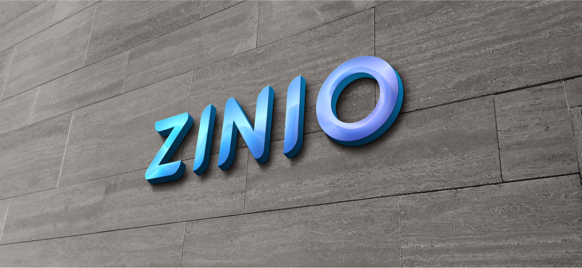
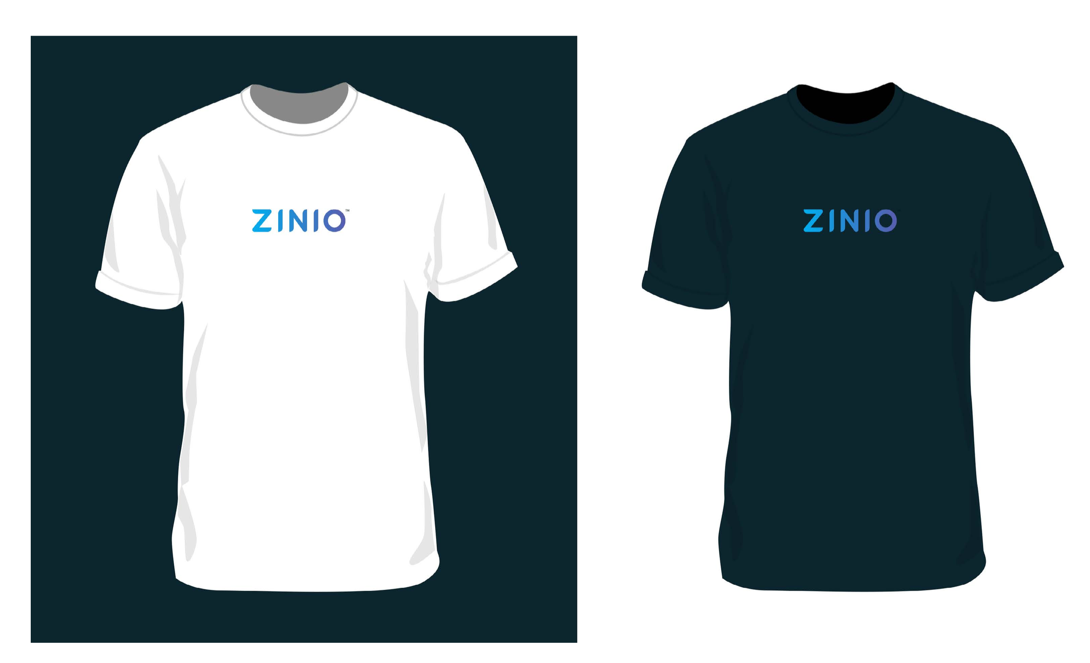
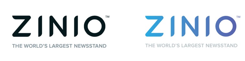
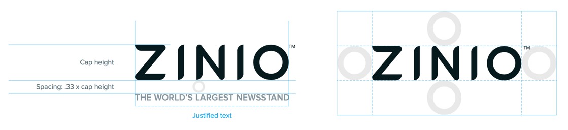
The Wordmark
With a desire to make bold changes, a new logo was a requirement in the rebrand. The new mark moved away from the lowercase serif mark to a more tech-influenced and streamlined aesthetic of a modern media company. With simple geometry of vertical lines, circles, and diagonals as a basis, the new mark was constructed to be highly legible, versatile, and friendly.


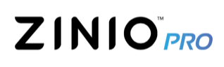


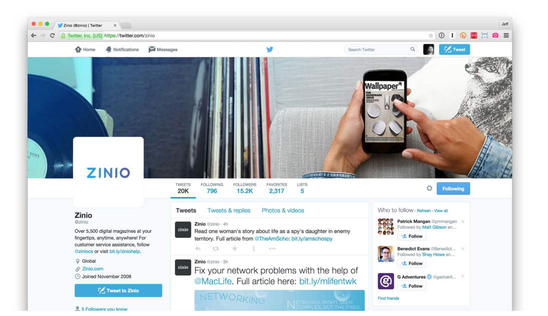
App Icons
Icons can be used as clear communicators for a brand or product when done well. Producing a memorable mark becomes increasingly difficult with millions of apps in the app store. After an audit of other players in the space and alphabetical neighbors, it was decided that the brand has far more equity in its full name rather than a graphic representation of reading or the letter ‘Z’.
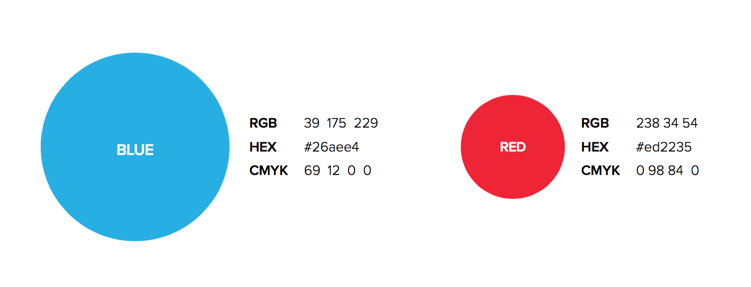
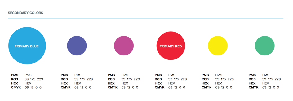
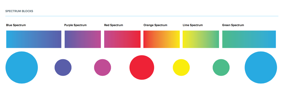
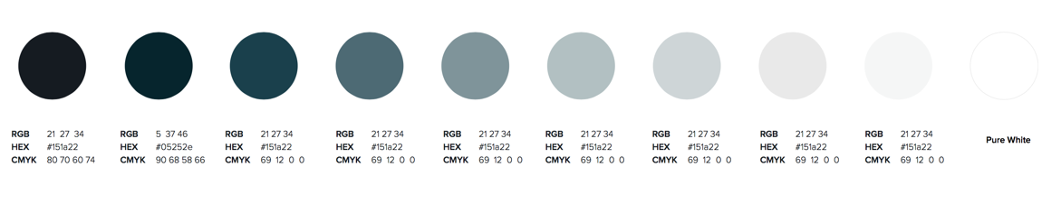
Color
The past brand expressions and product used a dark color palette with muted accent colors. Referencing the product design tenants of LIGHTER, BRIGHTER, VIBRANT, the new colors chosen worked best for creating a richer, highly-legible experience. Blue and red maintained their places as primary colors, but with a higher saturation for clarity and to impact click-throughs. A secondary palette provided an entire new range of colors to create more variety and visual interest.


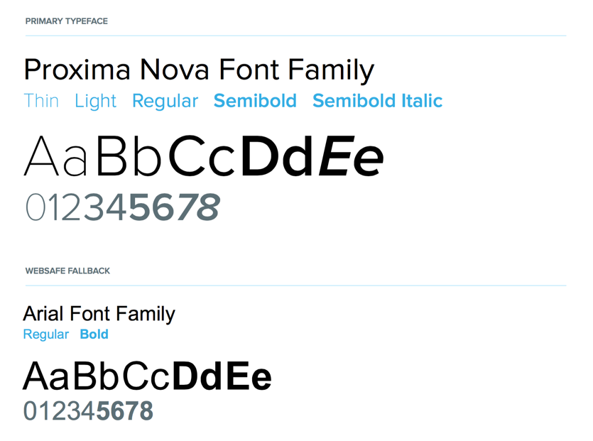
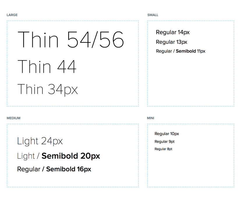
Typography
Legibility and accessibility were key factors in deciding on the proper typeface for the product and the brand. Proxima Nova was chosen for its large family, geometric consistency, and simple aesthetic. It also provided a seamless transition from its legacy use within the website.


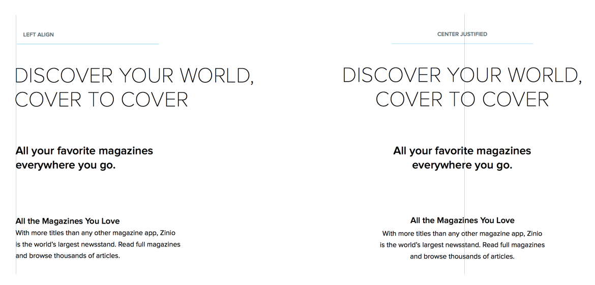
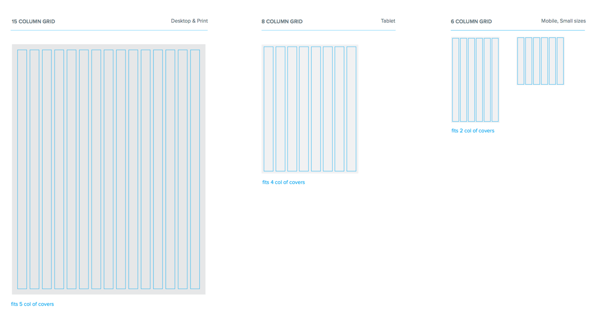
Grids & Layouts
The grid structures were designed to best showcase magazine covers no matter the device or magazine proportions. This meant optimizing a range of sizes for maximum legibility and visual impact. Multiple grids were also created to optimize for varying device proportions, viewing distances, and browsing circumstances.

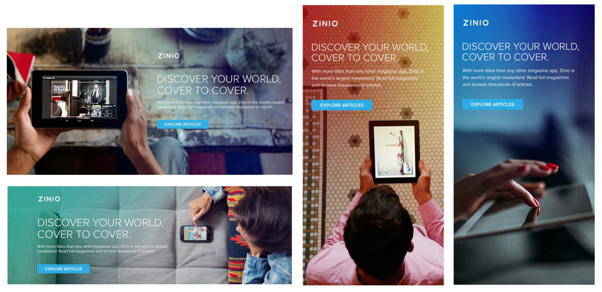
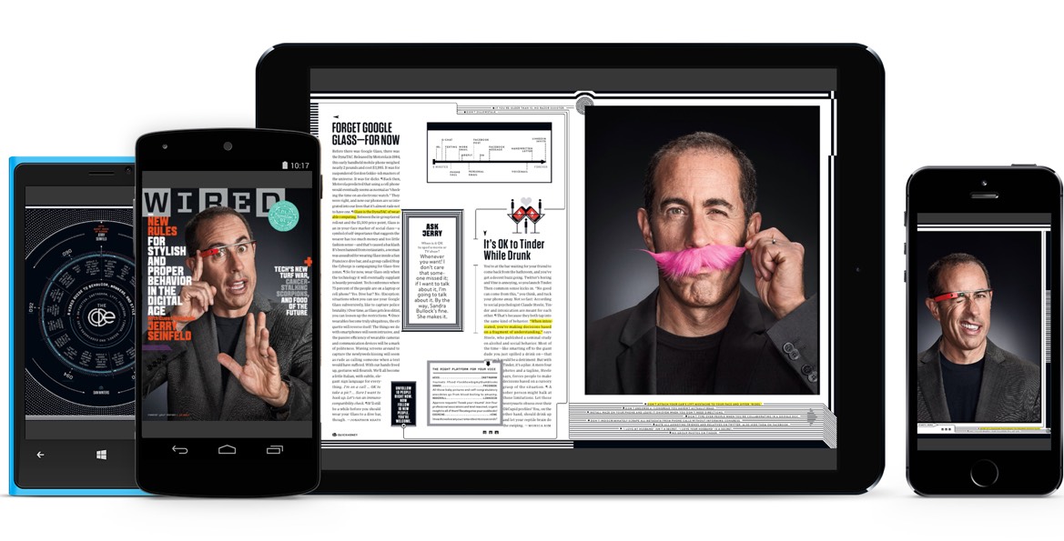
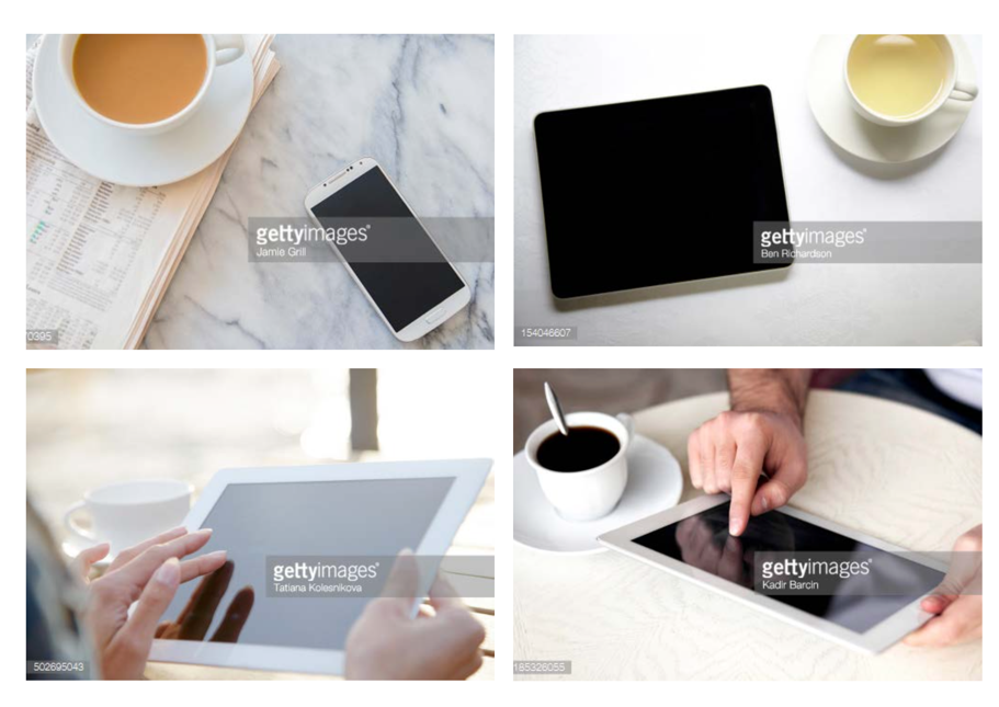
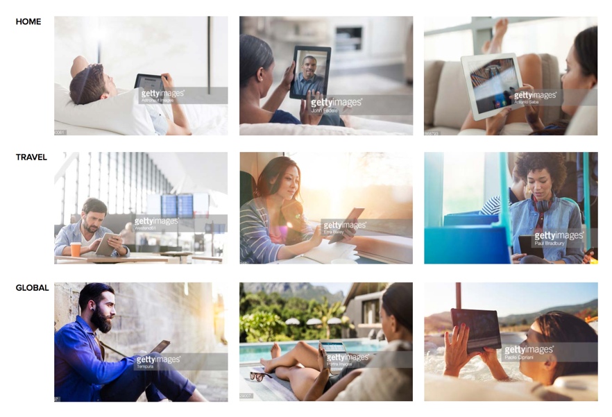
Photography
ZINIO’s brand photography is built on two pillars of expression: Devices and Lifestyle with Devices. Each pillar works to tell the brand’s visual story. Images can be used together or separately to place emphasis on human interactions with our product or on the breadth of devices our product is available on.


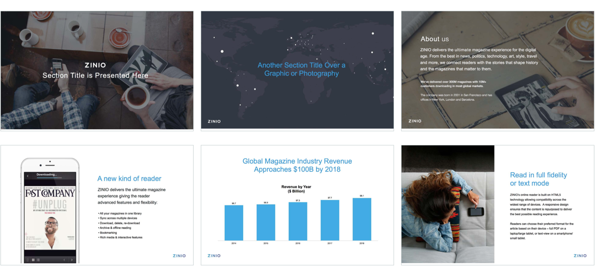
Application
Various sample applications and real-world touch points were created as templates to aid in extending the brand and its reach. As a growing, global company with stakeholders and departments in multiple cities throughout the world, it is extremely important to align the brand in a consistent form. These sample applications help to facilitate that goal.