
OPTIMIZING FOR SCALE
ZINIO has been the industry leader in digital magazines since 2001. They pioneered the technology and publisher relations to create the largest collection of digital magazines in the world. And, with the introduction of the iPad and other tablets in 2010, ZINIO's growth has exploded.
As part of its rebranding and product transformation, ZINIO optimized its products on a feature-by-feature basis, parallel with a full rebranding and larger established design tenants. The goal was to reach feature parody and create a consistent experience across multiple devices before new features and UI are introduced. Common feature paths and functionality also allowed for a simplified internal workflow.

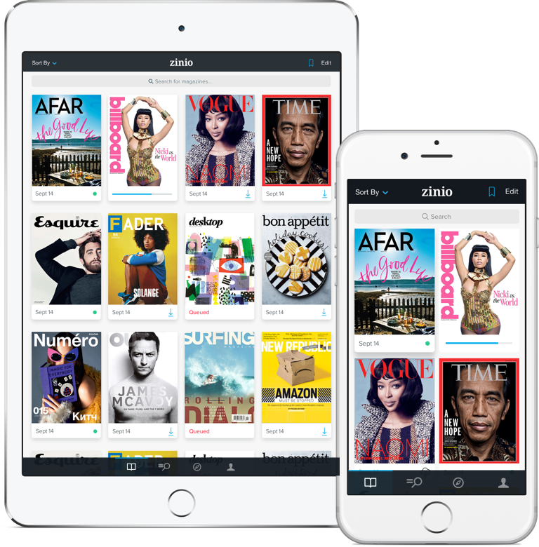
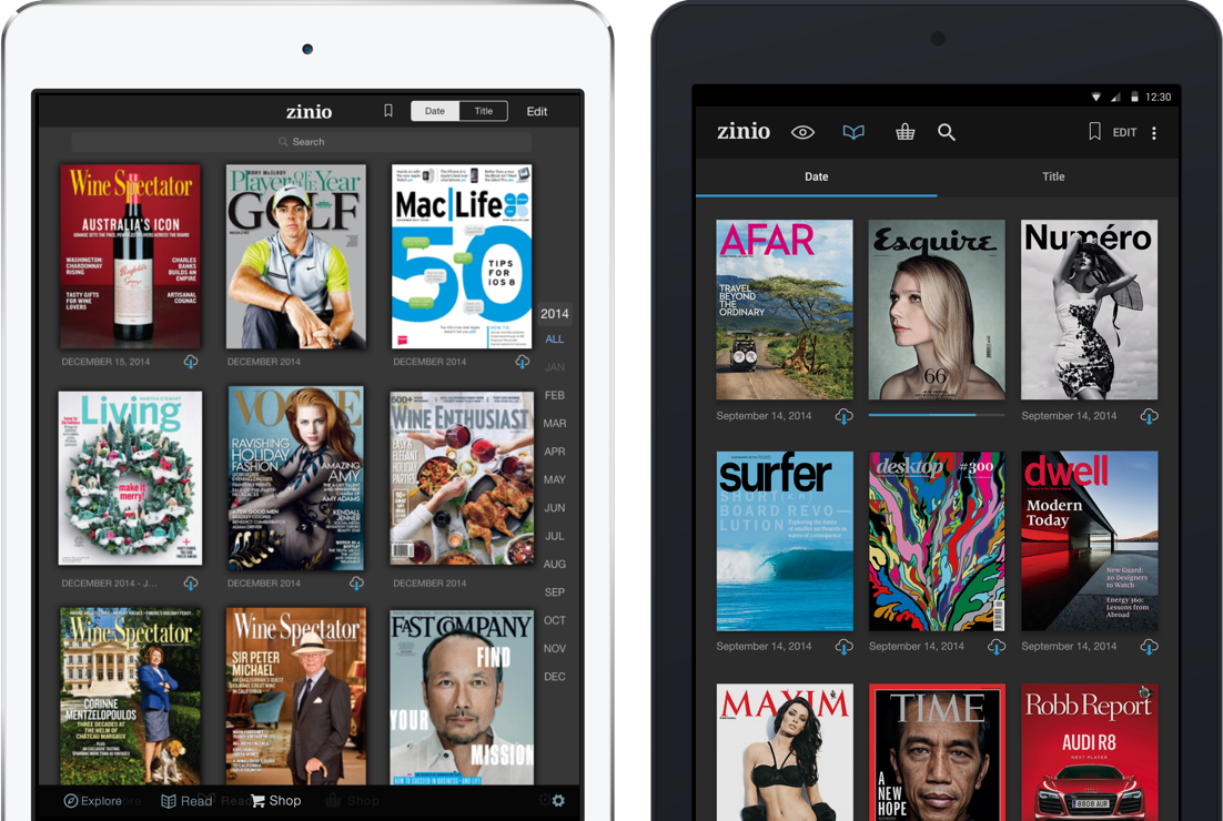
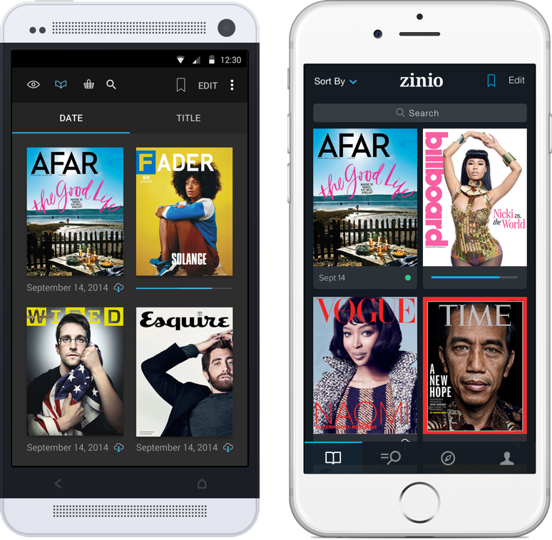
READ: The Library
The single most important feature of ZINIO's offering is the Library coupled with the proprietary magazine Reader. The Library takes precedence as its the first point of contact with a reader's magazine collection.
Various key features were fine-tuned to take advantage of a new iOS, larger screens, and higher resolutions. Features such as Search were made larger and more prominent while leveraging a new backend engine that provided results instantly. The date scrubber was moved to the right side of the screen to be more inline with iOS standards. Covers were made larger for legibility and visual impact. Settings were simplified and a queue-based download system was built to allow readers to queue multiple titles for offline viewing.


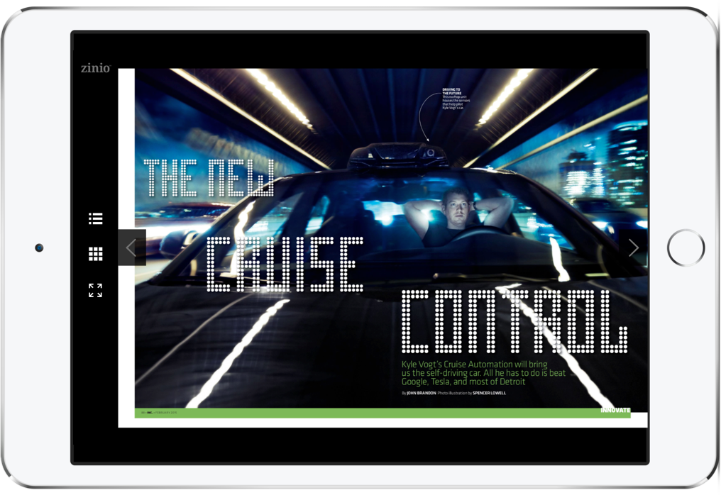
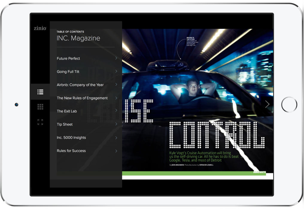
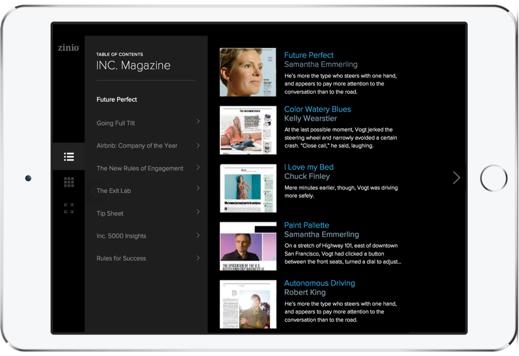
THE READER
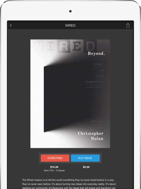
Coupled with the library view, the Reader is THE reading experience. It takes the digital content of each publication and allows users to easily browse, search, bookmark, and zoom in on the contents of a particular issue.

SHOP
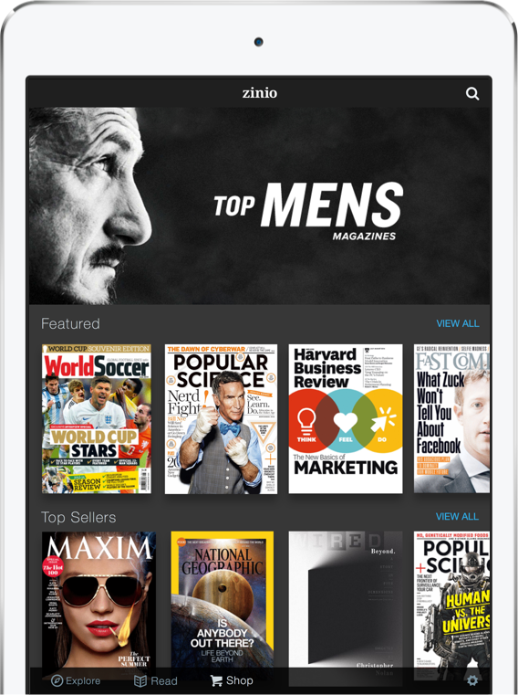
Looking to optimize conversion, the Shop landing page was redesigned to display top sellers and featured items in a more prominent way. Similar to the Library, Search was improved and various categories and interests were surfaced to improve discoverability.


ONBOARDING
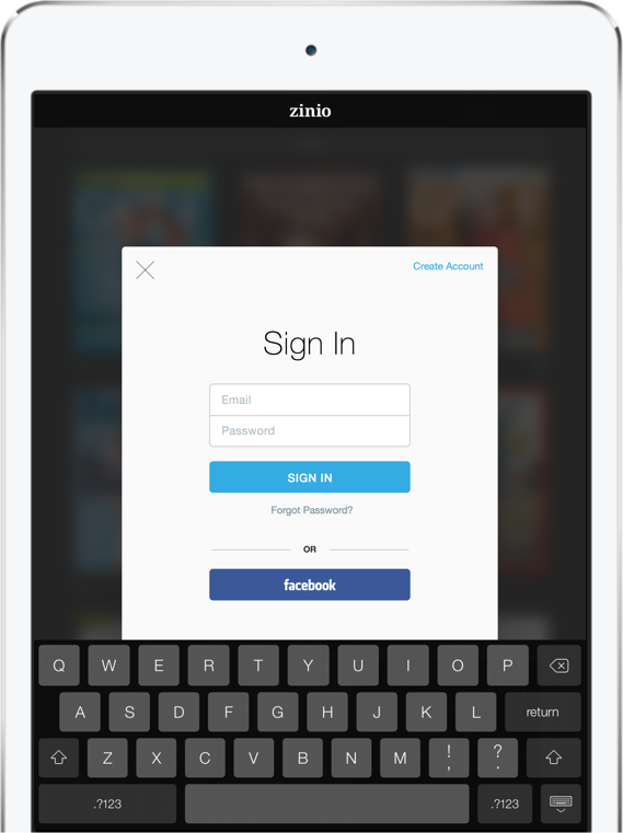
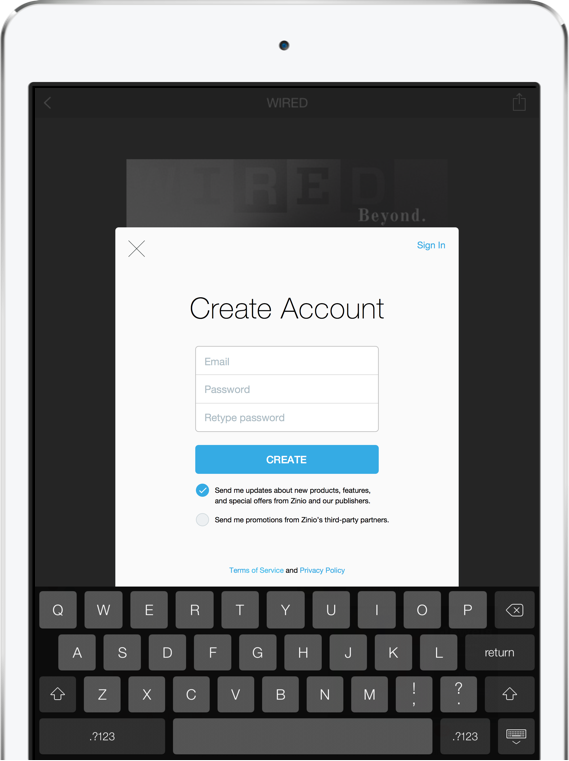
A crucial educational aspect of any product, ZINIO's onboarding had over five design variations. Looking to create consistent and clear Sign Up and Log In experiences, the flows for each user path were audited and refined to reduce friction for a new or returning user's access to the product.


LIGHTER. BRIGHTER. VIBRANT
The iOS and Android platforms continue to undergo a process of change. The design tenants that created the foundation for the rebrand and responsive web were applied to create a cohesive and consistent user experience on our mobile apps.