
MODERINZING THE DIGITAL NEWSSTAND
Zinio has been the industry leader in digital magazines since 2001. They pioneered the technology and publisher relations to create the largest collection of digital magazine in the world.
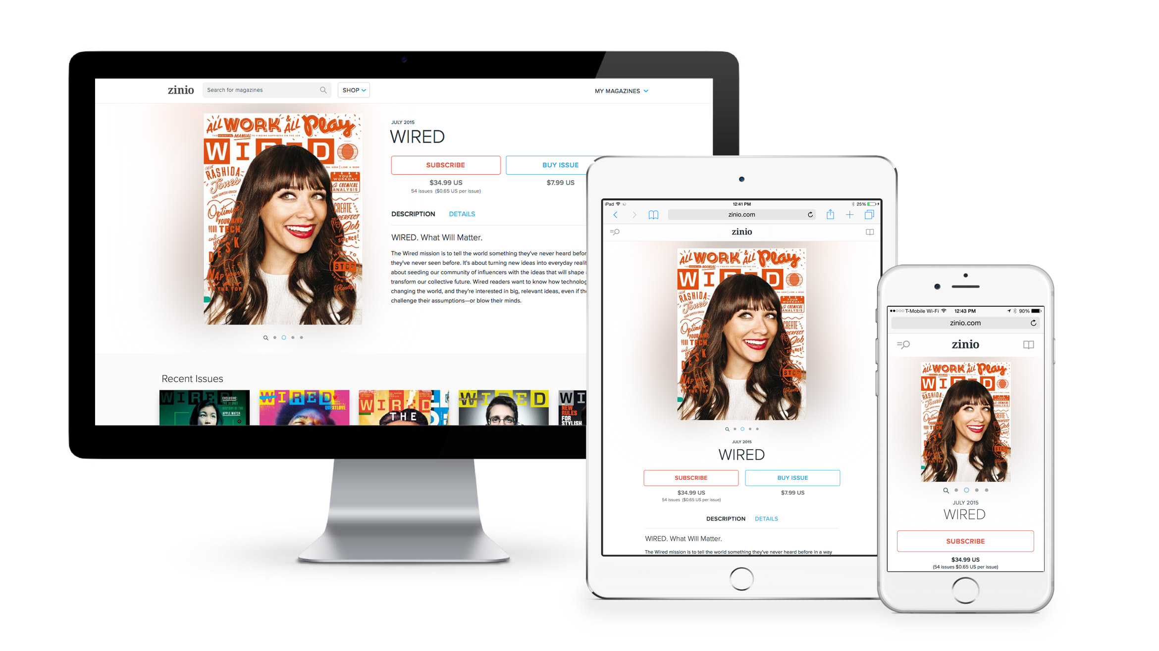
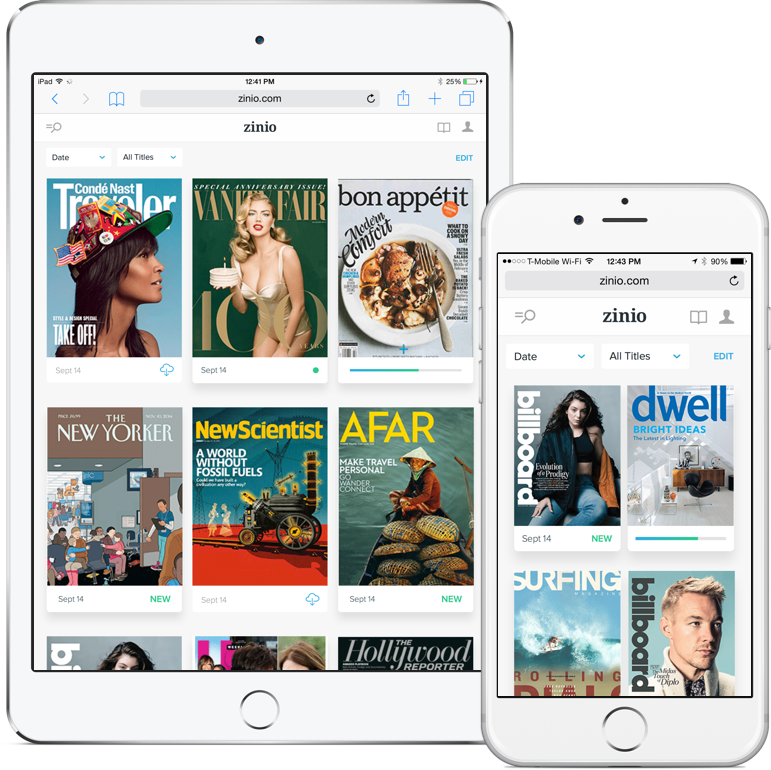
Zinio.com is an important contributor to the various platforms on iOS, Android and Windows Mobile. The increase of mobile traffic led to a redesign that was fully responsive to support desktop, tablet and mobile. This extended into designing a new payment flow, a simplified checkout/cart system and a more consistent Sign Up/Log In experience. A new library view was introduced to help users better manage their library.
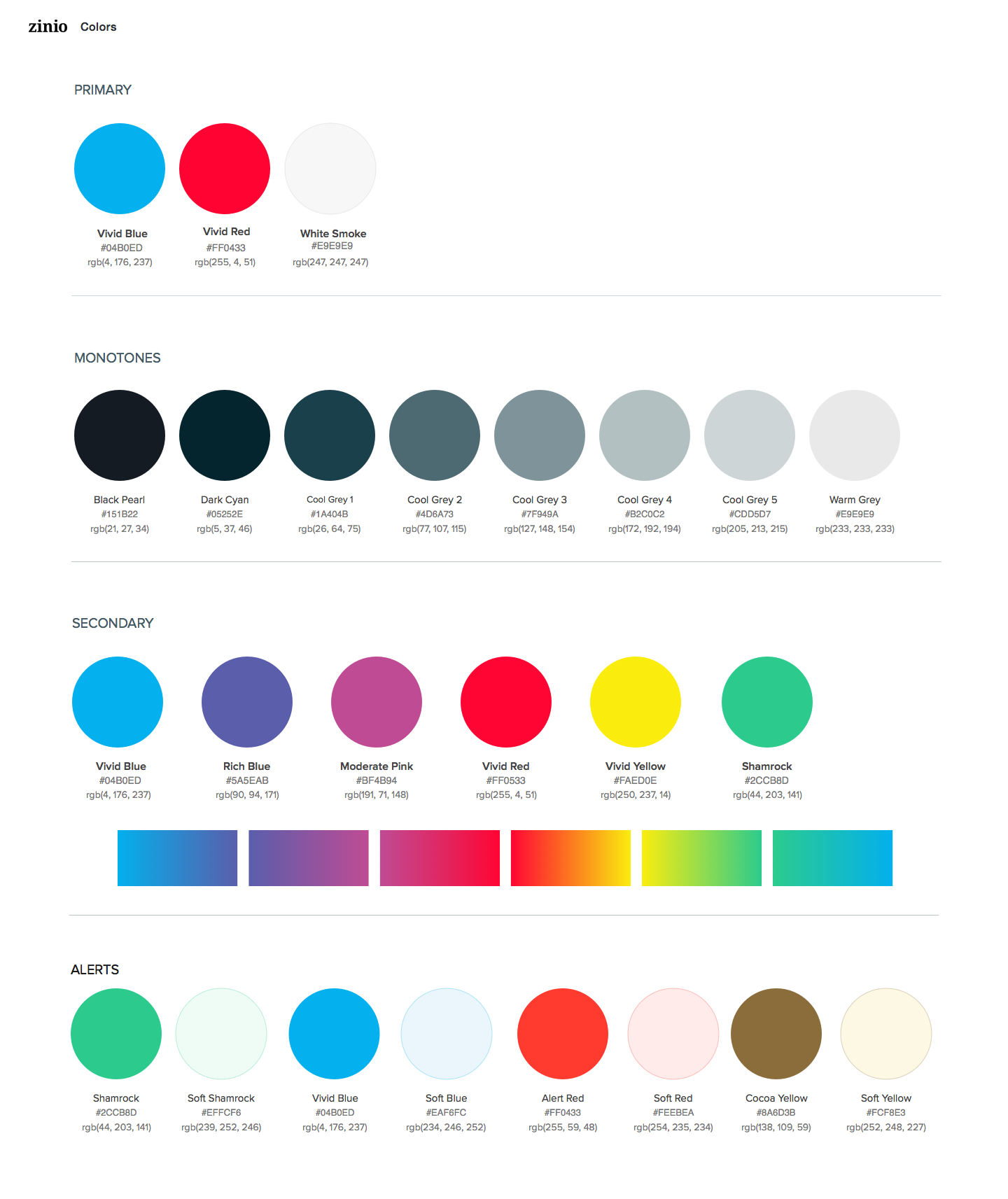
All of these improvements in design we’re stitched together through unified design tenants – Lighter. Brighter. Vibrant.

Lighter. Brighter. Vibrant.
A refined design direction that focuses on clarity & legibility with a content-first approach.
The general experience across platforms have become slightly disjointed. iOS, Android and WM8 display a very dark UI. While the website was mostly white. In an effort to unify the platforms as one cohesive brand experience LBV was born.
Lighter.
Refers to the reduction and visual weight of unnecessary graphics, UI, animations or legacy embellishments. It’s purpose is to keep the visual structure focused and the user engaged in the content first.


Brighter.
Unifies all of the platforms with backgrounds that are white or soft grey. It creates more contrast to increase legibility.
Vibrant.
Unifies all of the platforms with backgrounds that are white or soft grey. It creates more contrast to increase legibility.

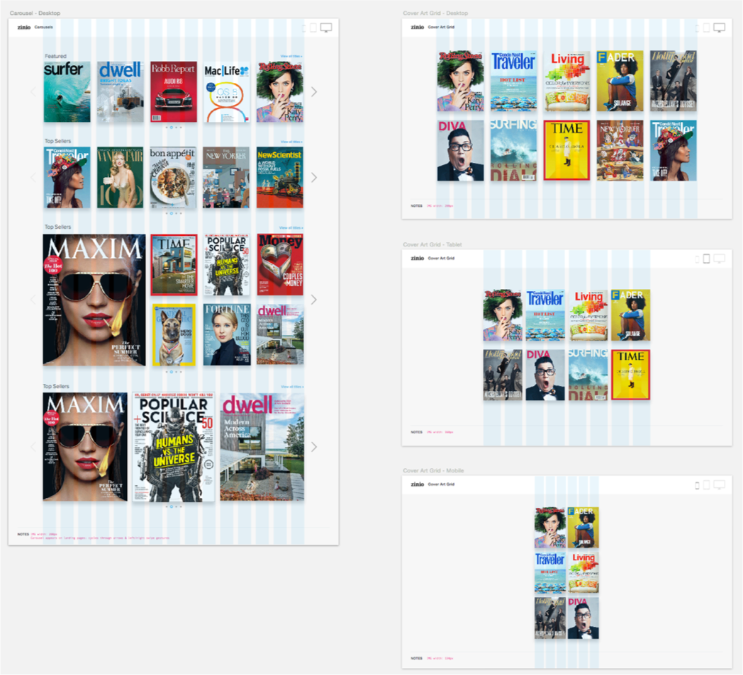
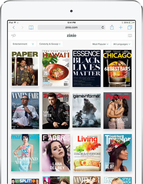
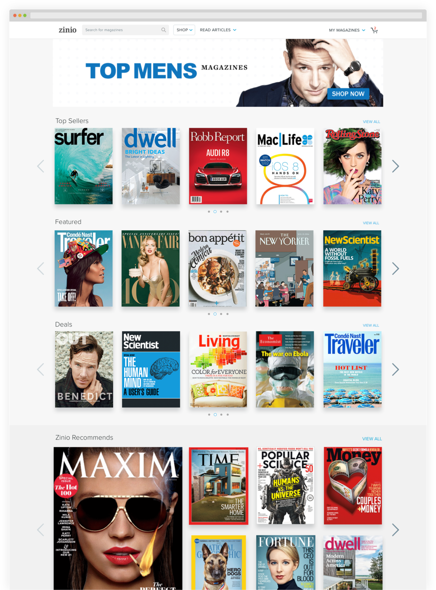
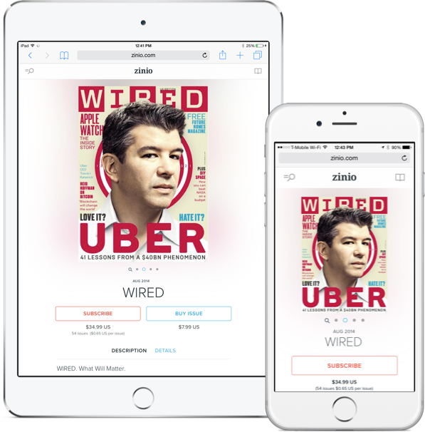
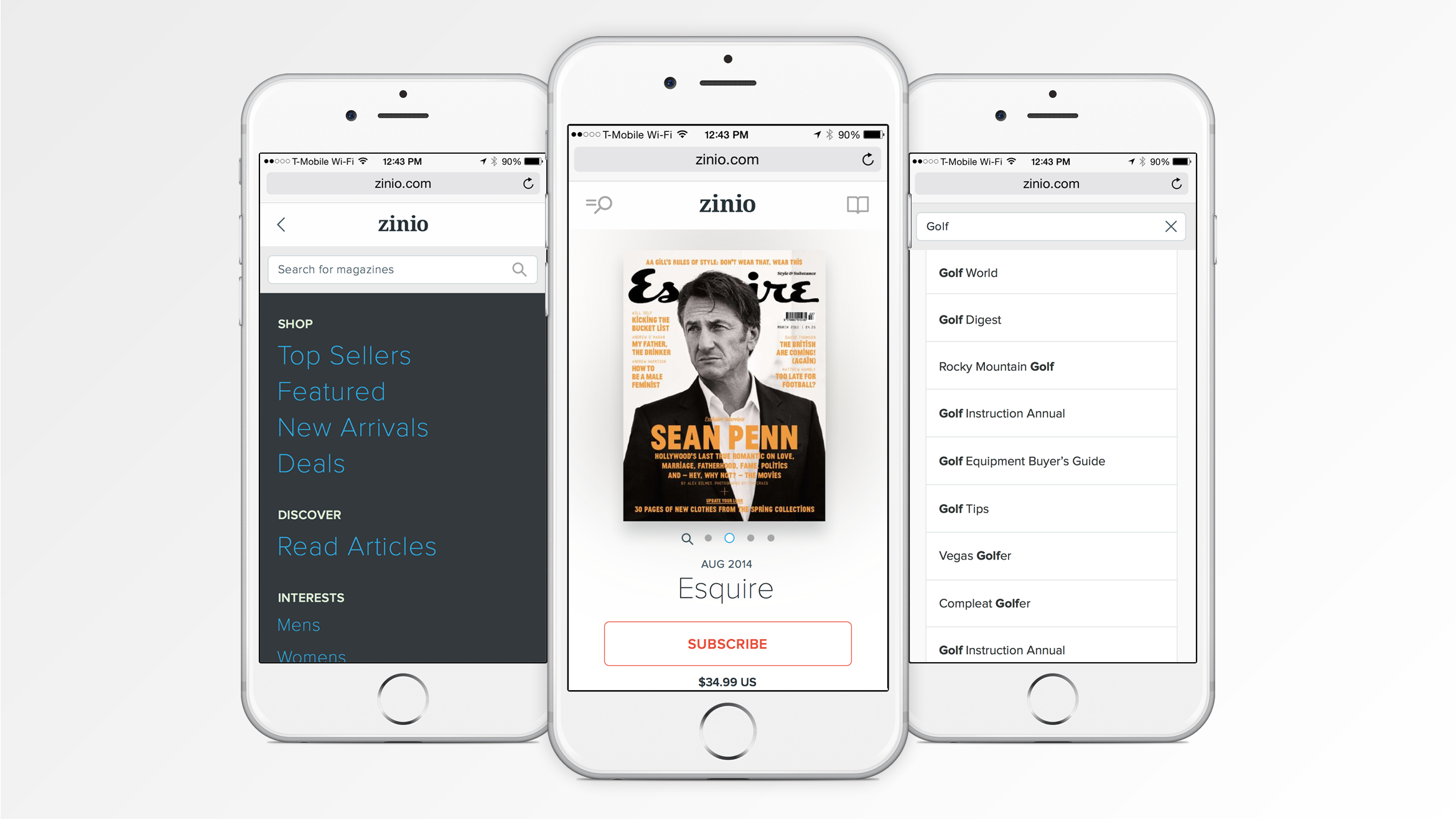
RESPONSIVE SHOPPING
Every screen has been redesigned to take advantage of a wider grid to provide more impactful cover presentation. The cover carousels we’re refined to provide smoother motion and interactions. In addition, variations in size and proportion we’re introduced to create a more pleasing scrolling preview.

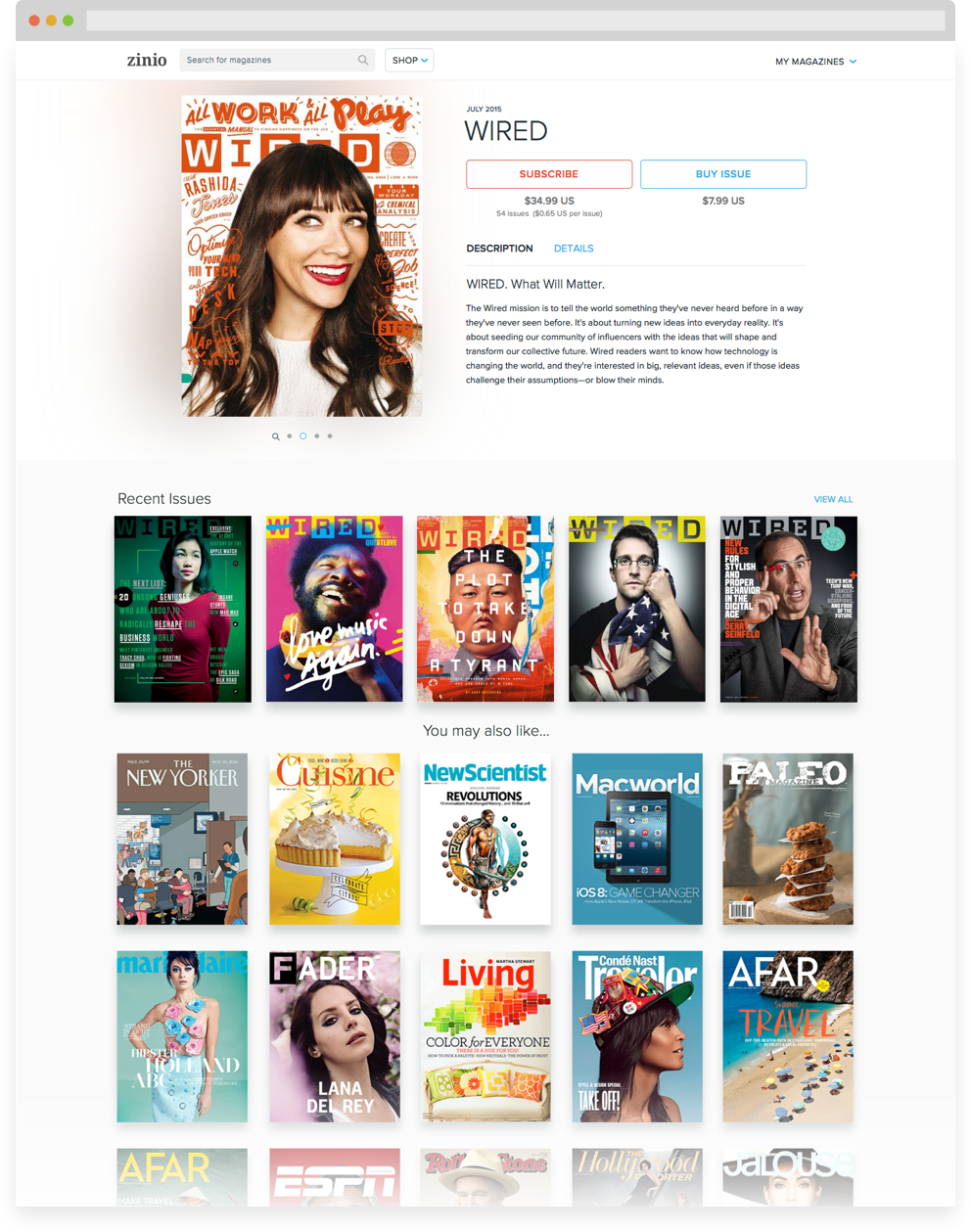
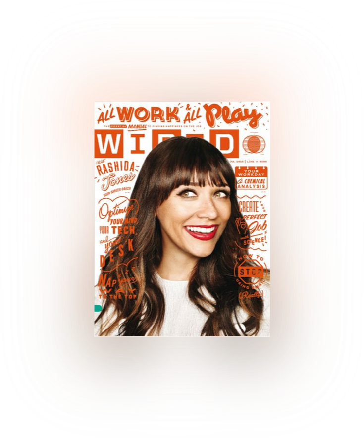
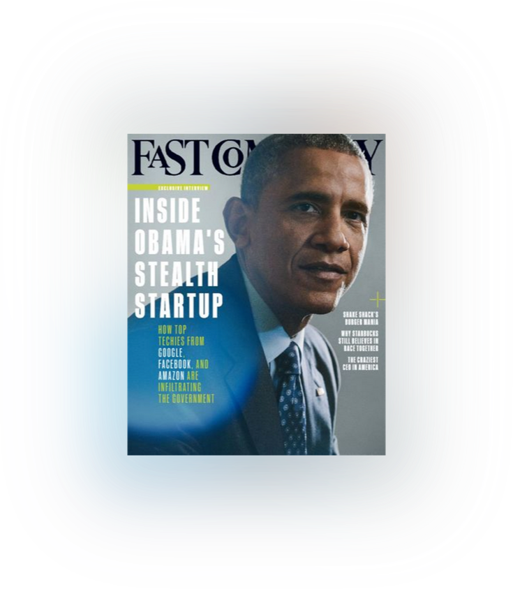
PUBLICATION PAGES
Every screen has been redesigned to take advantage of a wider grid to provide more impactful cover presentation. The cover carousels we’re refined to provide smoother motion and interactions. In addition, variations in size and proportion we’re introduced to create a more pleasing scrolling preview.


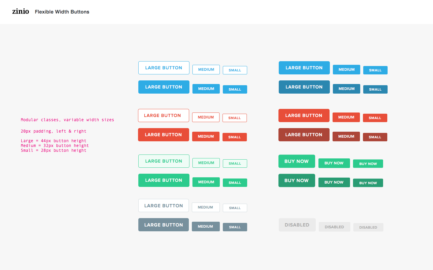
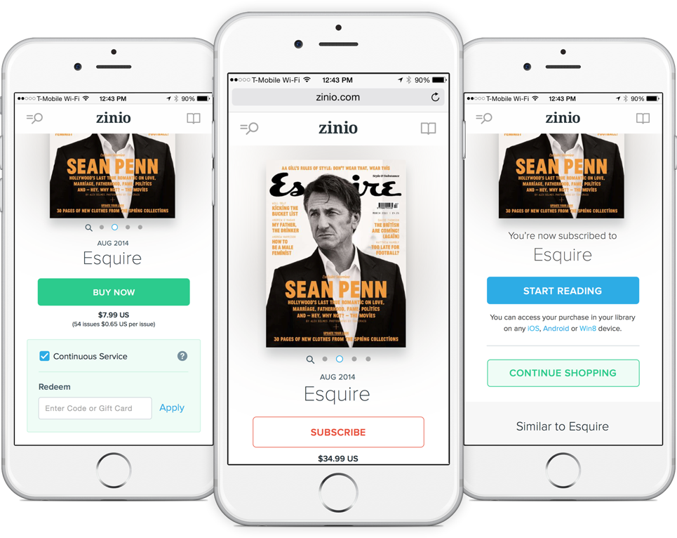
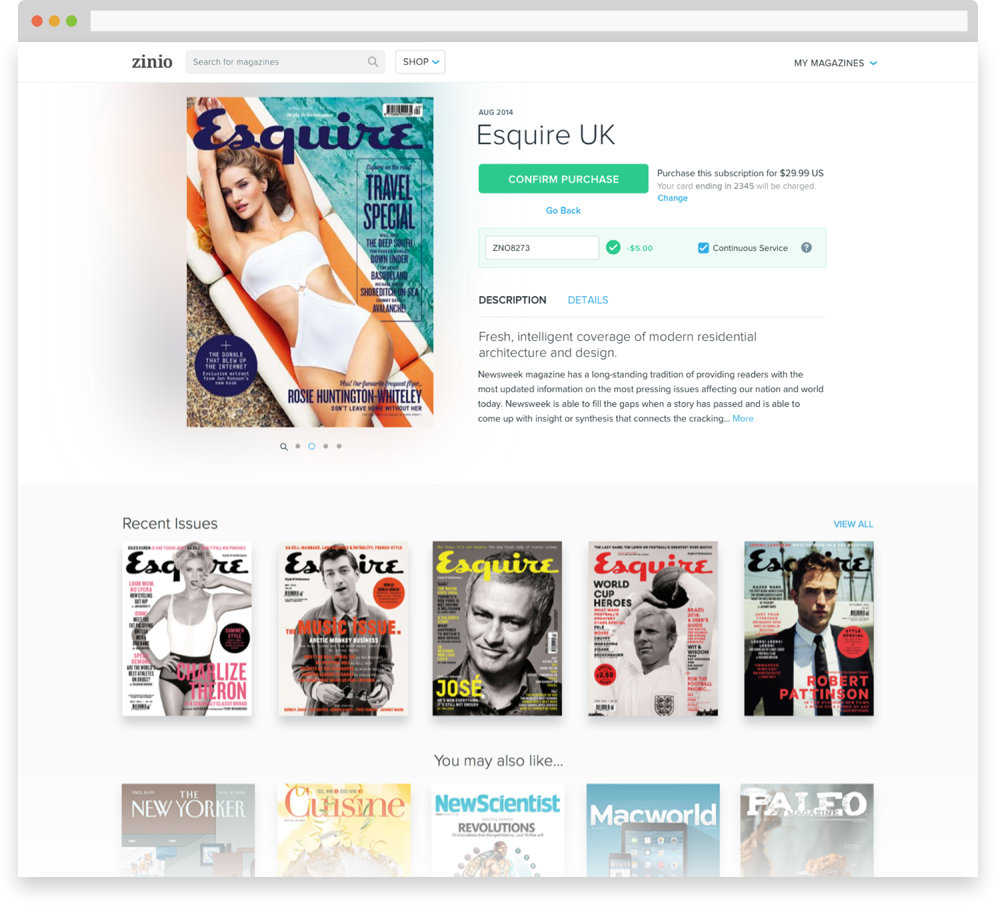
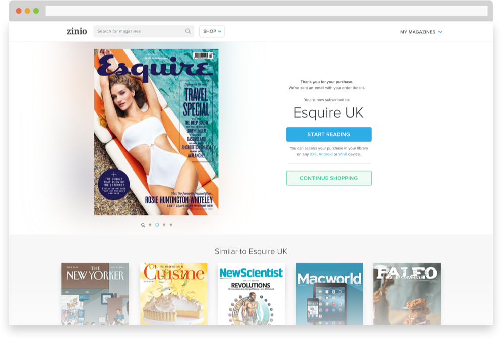
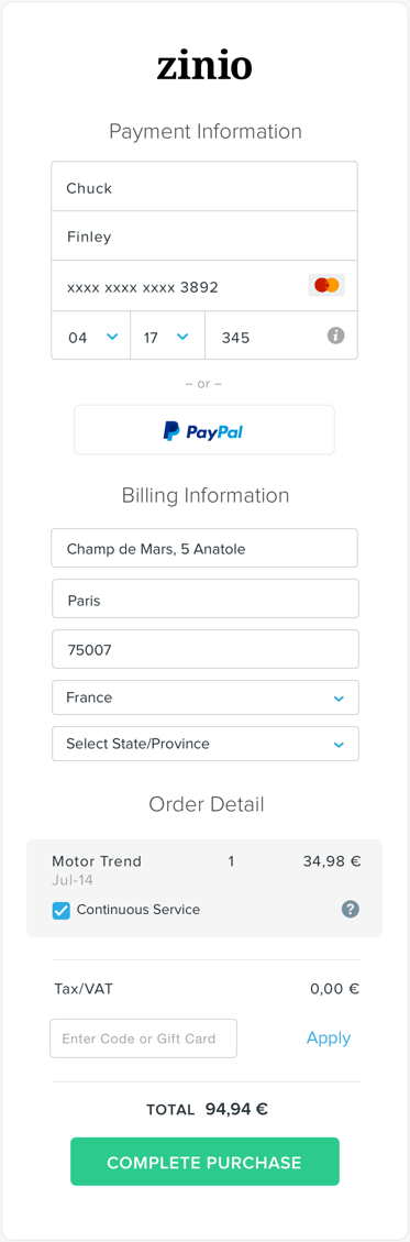
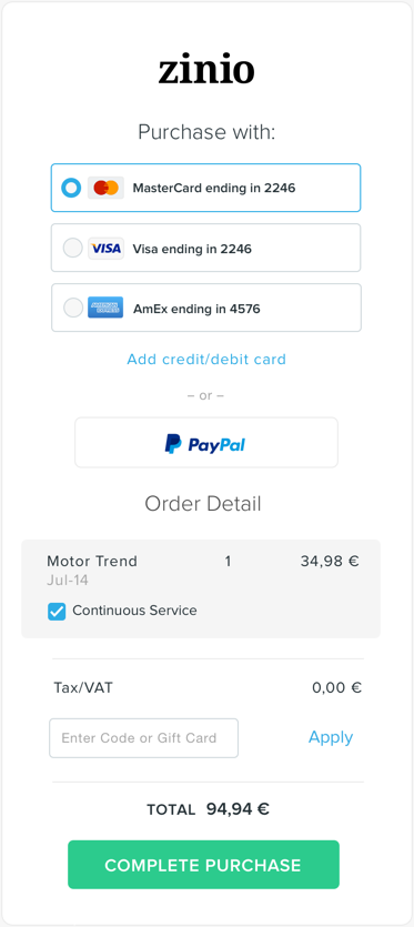
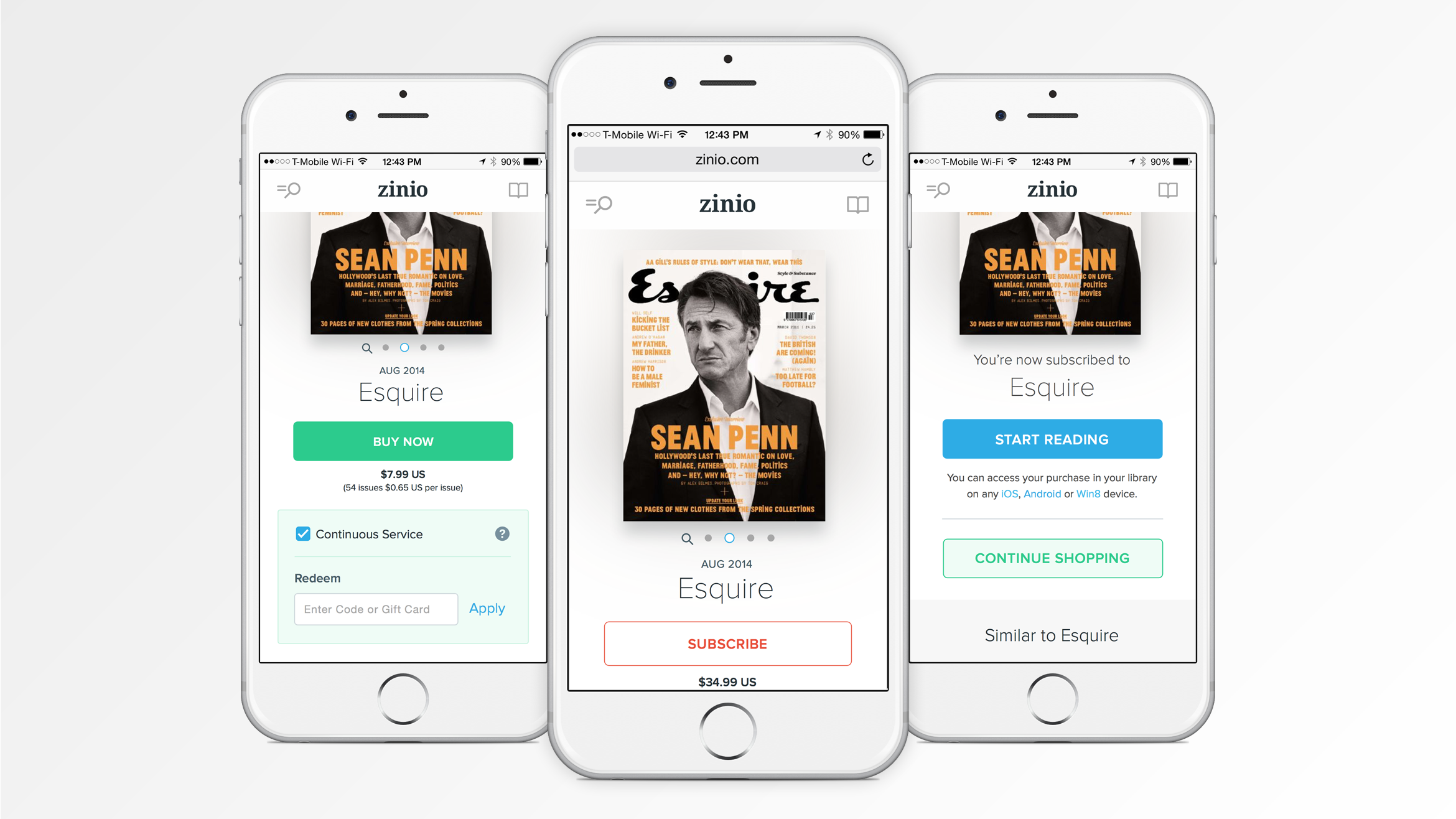
SIMPLE CHECKOUT
A simplified checkout system was specially created to increase the ease from browsing to reading in seconds. Once a user has made their account has a credit card on file, they can purchase magazines with 2-clicks – Buy > Confirm.


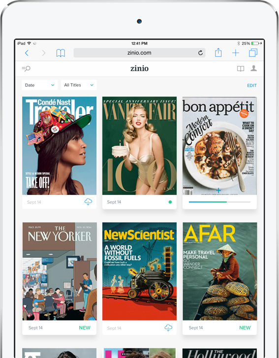
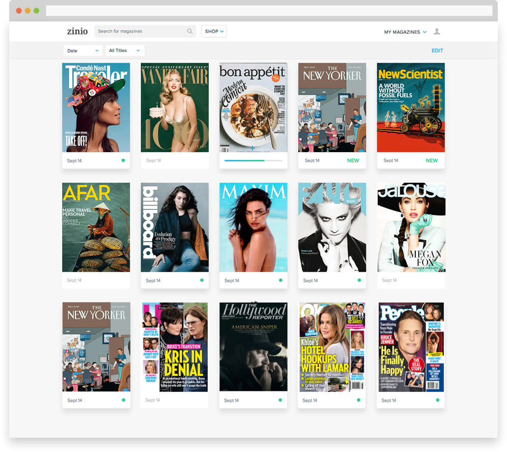
LIBRARY COLLECTION
The ZINIO library is a virtual magazine collection. Once purchased, all magazines live in a date/title sort grid presentation.


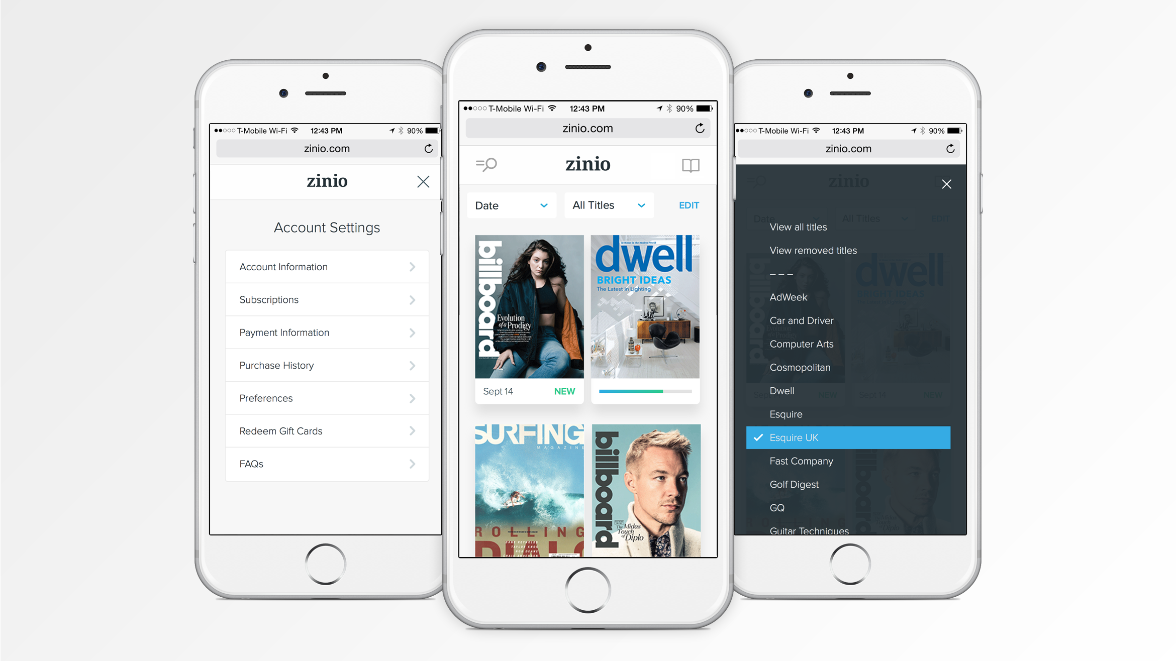
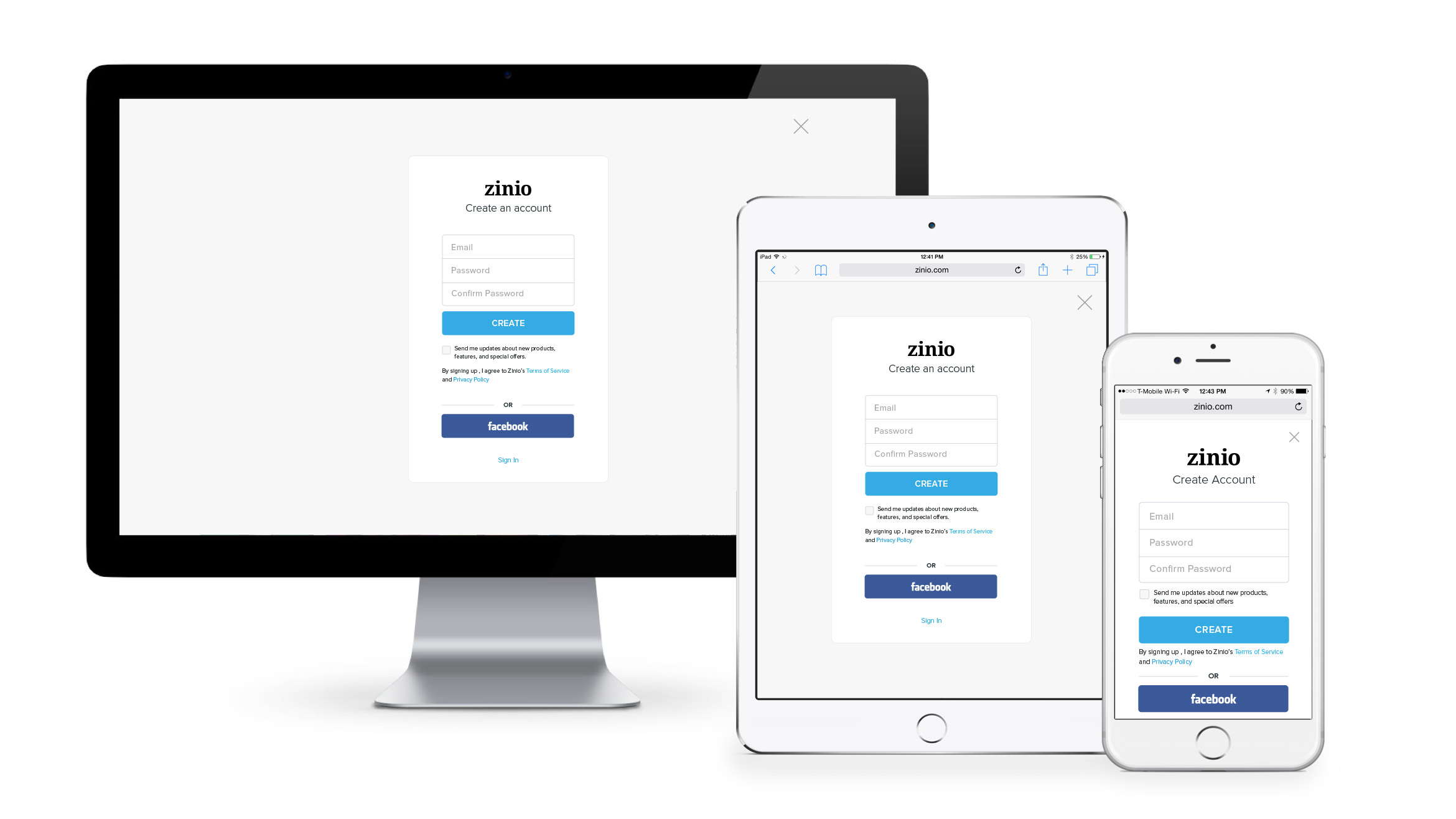
SIGN UP/LOGIN
The Sign Up/Login flows were simplified to modals that can be triggered at any point of the experience. The entry fields and Facebook sign up actions have been simplified with larger fields and buttons.

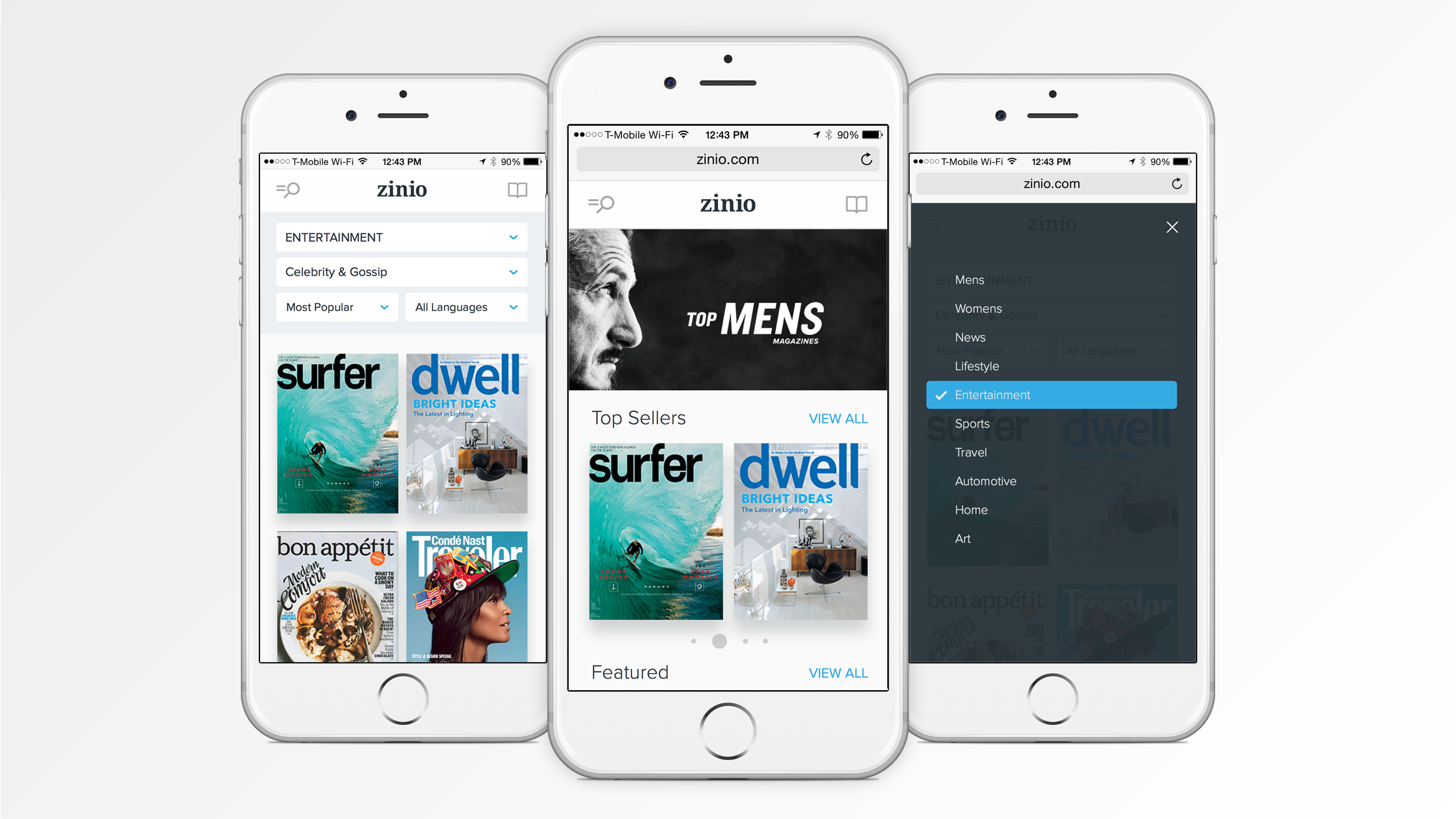
REFINED NAVIGATION
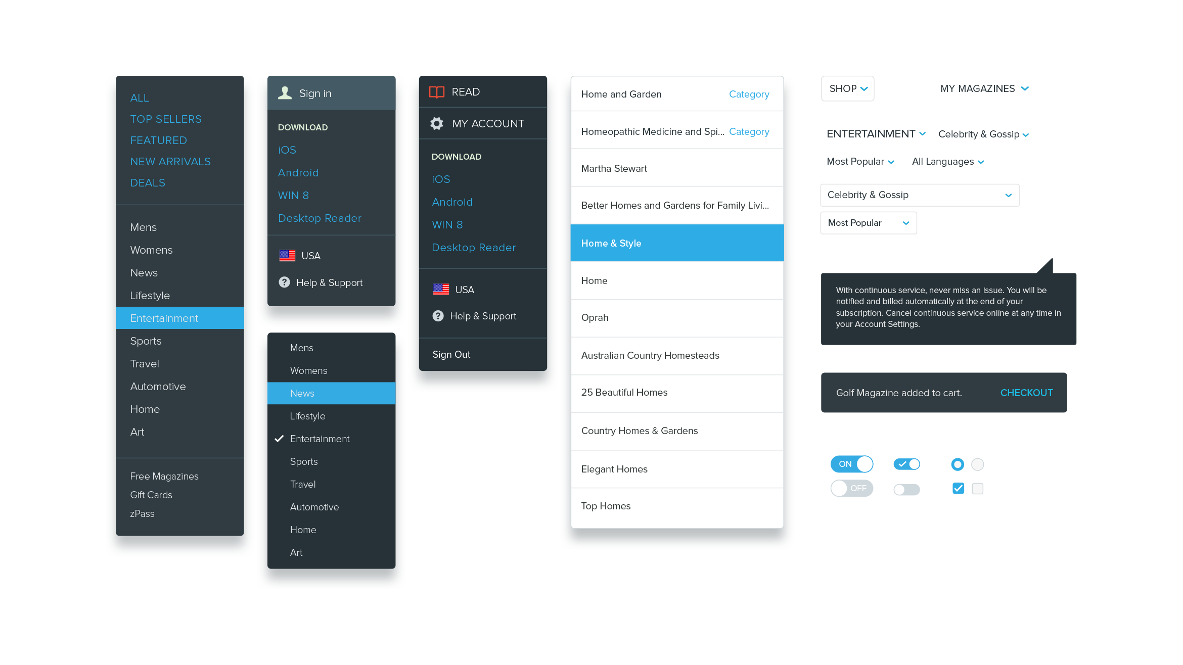
The most common points of navigation within zinio.com was though Search or Log In. The new responsive nav more than doubled the size of the search field and placed it top/left for high visibility. Access to your library, downloads, help and all pertinent account details are a tap away under ‘My Magazines.’ These refinements help to maintain a simple and focused shopping & discovery experience.

STYLE & PATTERN GUIDE